demand forecasting accuracy measurement
A guide for business forecasters.
If you don't measure demand forecasting accuracy you are unlikely to improve your demand forecasting accuracy by learning from your mistakes.
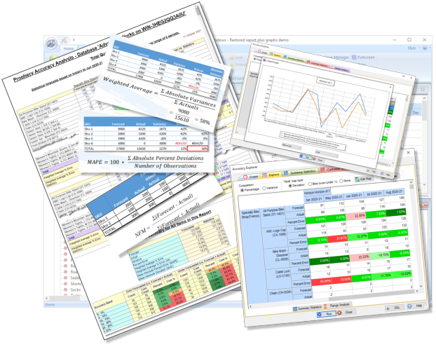
Prophecy™ offers industry standard demand forecasting accuracy measures and reports that you can run in an instant. Here, we summarize what's available in Prophecy, and the demand forecasting accuracy measures it offers.
 Accuracy Snapshot report
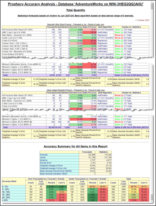
Prophecy generates a detailed forecasting accuracy report, with summary statistics, in a few mouse clicks. You can:
- Report on any combination of products and customers...
- ...over any valid time horizon...
- ...for any measure
- Filter in only the big percent deviations in order to see the wood from the trees.
- Compare the accuracy of the final forecast with what the statistical engine would have forecasted.
- View the demand forecast accuracy summary statistics, at each level of grouping.
Please click on the image to view a full Prophecy accuracy report snapshot. (The products and customers are fully selectable from any levels in the Prophecy hierarchies.)
 Accuracy Explorer
Prophecy's Accuracy Explorer tool tracks demand forecasting accuracy through time, using one or more selected demand forecast horizons. As in, the forecast made in January for March, February for April etc..
'Scope' tab
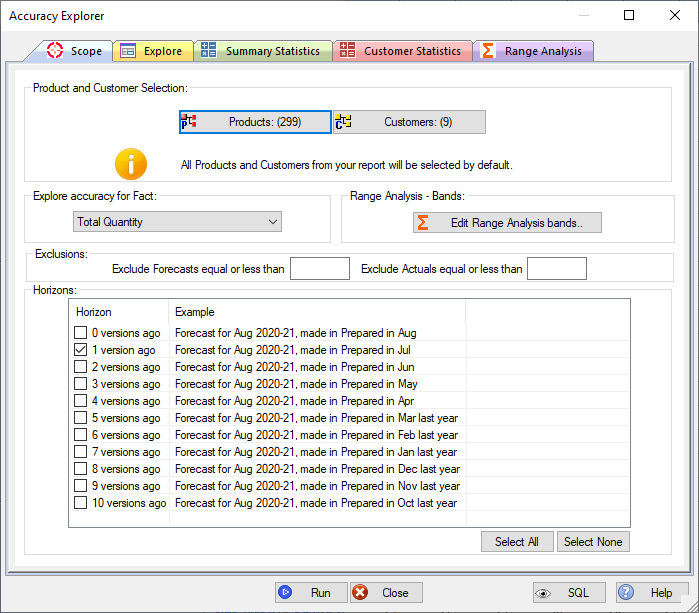
This page sets everything up. You can specify:
- The products and customers you want to analyse (from any hierarchy levels). (Accuracy Explorer defaults to the current selections in the active Prophecy forecast report.
- The forecast measure you wish to analyse.
- The time horizons you want to analyse.
- The accuacy bands (percent ranges) used to analyse accuracy on the 'Range Analysis' page.
- You can also filter items out - e.g. items with a zero forecast and/or actual.
'Explore' tab
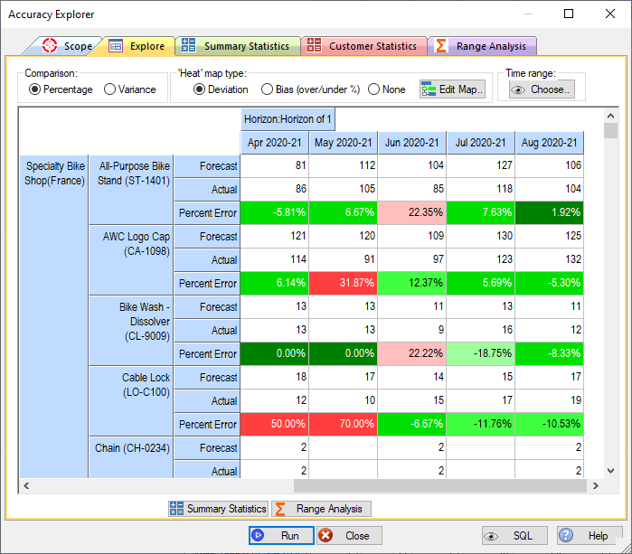
The 'Explore'' page presents demand forecasting accuracy for each selected time horizon. In other words, the forecast made in January for February, the forecast made in February for March etc.. Unlike the Snapshot report, this view lets you see forecast accuracy trends through time.
The view works like a pivot table in Excel. So the sample image has time across, measure within product within customer as rows and forecast horizon as the page item. But you can have any dimension (product, customer, time period, measure or horizon) on any axis, with any level of nesting. Just like the standard Prophecy forecast update screens.
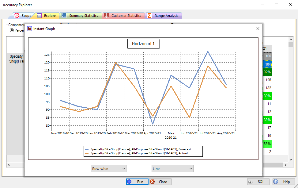
You can select any cell range in the view to generate an 'Instant Graph' - the example clearly shows the bias towards over-forecasting in recent months:
'Summary Statistics' tab
The 'Summary Statistics' tab shows the standard demand forecasting accuracy measures, by product and customer. The results can be sorted on any accuracy measure.
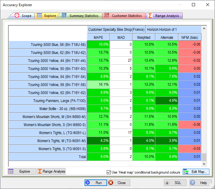
The standard demand forecasting accuracy measurement statistics shown are:
| Measure | Description |
|---|---|
| MAPE (Mean Average Percent Error) | The mathematical average of all the individual percent deviations,
regardless of their sign: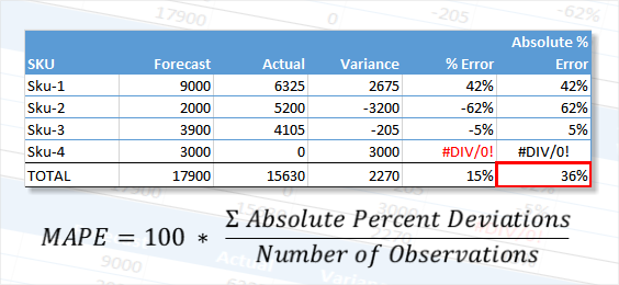
|
| MAD (Mean Average Deviation) | The mathematical average of all of the individual unit deviations,
regardless of their sign: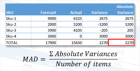 The advantage of MAD over MAPE is that instances like Sku-4, where there is no actual, are included in the measure. The same percentage error on a high volume item has a much bigger effect on the result, which may or may not be desirable where, for example, the high seller is low value and the low seller is high value. |
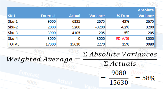
| Weighted Average % | This calculates a percent deviation by dividing the sum of the
absolute, unit deviations by the sum of the actuals, as illustrated in
the following example:
The advantage of summarising accuracy using weighted average deviations is that compensating errors are avoided. Therefore, in the example shown, Sku-2 and Sku-3 were under-forecasted and Sku-1 was over-forecasted. A straight percentage deviation between the totals, 17900 and 15630 would give a deviation of 15% whereas the 58.0% weighted average describes the overall accuracy level more robustly. Note also that a forecast was made for Sku-4, but there was no actual sale. Nevertheless, the unit variance is included in the calculation, as it would be if there was no forecast and an actual sale. |
| Alternate Weighted Average % | This calculation is similar to the Weighted Average % Error.
However, instead of dividing by the sum of the actuals as shown in the
example above it divides by the sum of the forecast or actual for each
line, whichever is greater. This means that actual=0/forecast=100
has the same weight as actual=100/forecast=0. For 2 items with
these forecasts and actuals the weighted percent is 200% (misleadingly
high?) whereas the Alternate Weighted percent is 100% (perhaps closer to
'correct' because both items were effectively 100% out?). This alternate calculation method for a weighted average may be considered superior because a zero actual is excluded from the denominator in the original method. The calculation is shown in the following example: 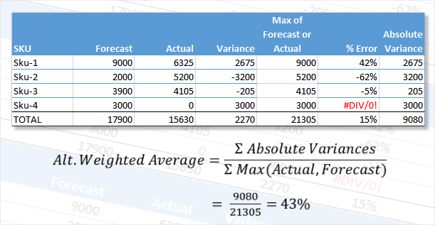 Note that the effect of using this method instead of the standard weighted average is that the accuracy percent changes to 43% from 58%. This method will always result in a lower percent error because the denominator is always bigger (because we're choosing the largest of forecast and actual for each item). |
| NFM (Normalised Forecast Metric for bias) | NFM is a measure of forecast bias - i.e. is there a general tendency
towards over or under forecasting? It has a range from -1.0 to
+1.0, where a negative number indicates bias towards under forecasting
and a positive number indicates bias towards over forecasting. The
desired bias - i.e. none, is represented by a NFM of zero: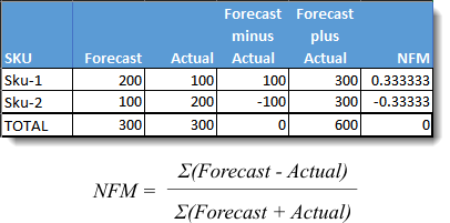 |
Accuracy measurement by Customer
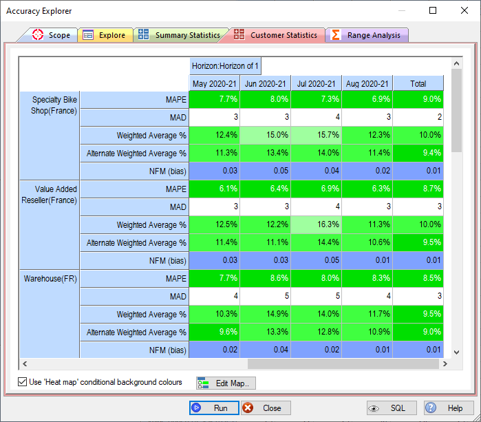
The 'Customer Statistics' page summarises the demand forecasting accuracy by customer by time period.
You again get the standard accuracy measurements, MAPE, MAD, Weighted Average Percent, Alternate Weighted Average and Bias (NFM).
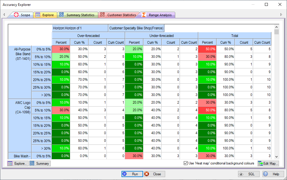
demand forecasting accuracy bands analysis
Another way to analyse accuracy is via a frequency distribution of the percent errors, split out into over-forecasts, under-forecasts and unders and overs combined.
This view format also helps to analyse forecast bias. For example, for the first product in the screenshot (sku ST-1401) 70% of forecasts were over-forecasted, compared to 30% under-forecasted.
